
| Key Takeaway Mobile first indexing means Google primarily uses the mobile version of your website — not the desktop version — to crawl, understand, and rank your content. This has been Google’s standard for all websites since 2021. If your mobile site has less content, slower speeds, missing structured data, or a broken user experience compared to your desktop site, your rankings suffer directly. Optimising for mobile first indexing means making your mobile site the best version of your website. |
Your website looks stunning on desktop. The navigation is intuitive, images are perfectly sized, and every page loads quickly. But when you view it on a smartphone — the device used for over 70% of global searches — the experience degrades dramatically. Text is too small to read, elements overlap, images stretch incorrectly, and the load time doubles. This is exactly the scenario that mobile first indexing was designed to address — and if this describes your website, your rankings are paying the price.
Understanding mobile first indexing is no longer optional for any business with an online presence. This guide covers what it is, when it started, what problems it creates, and exactly how to optimise your website for it — with specific guidance for e-commerce businesses where mobile experience has the most direct revenue impact.
What Is Mobile First Indexing?
Mobile first indexing means Google predominantly uses the mobile version of a website’s content for indexing and ranking. As defined in Google Search Central’s mobile-first indexing best practices, Googlebot primarily crawls and indexes the mobile version of pages when evaluating content for its search index. Desktop content is secondary.
In practical terms: if your mobile site shows less content than your desktop site — fewer words, missing images, absent structured data, or different headings — Google evaluates the mobile version for ranking purposes. The rich desktop experience that you spent months perfecting is not what Google primarily uses to determine where you rank.
When Did Mobile First Indexing Start?
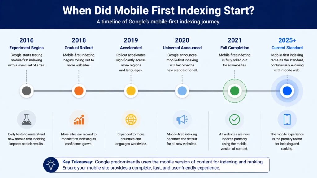
Mobile first indexing started as a limited experiment in 2016 and reached full universal deployment in 2021. Understanding the timeline helps explain why many websites experienced ranking changes they could not initially explain.
| Year | Milestone | What Happened |
| 2016 | Experiment begins | Google announces it will experiment with mobile-first indexing for a small set of websites |
| 2018 | Gradual rollout | Google begins migrating websites to mobile-first indexing based on readiness signals |
| 2019 | Accelerated rollout | Google speeds up migration — majority of new websites indexed mobile-first by default |
| 2020 | Universal rollout announced | Google announces all websites will move to mobile-first indexing |
| 2021 | Full completion | Google completes migration — all websites now use mobile-first indexing by default |
| 2025+ | Current state | Mobile-first indexing is the standard — no desktop-first crawling option remains |
Does Google still use mobile first indexing? Yes — completely and universally. As of 2021, mobile first indexing is not an option or a setting — it is the default standard for all websites. There is no mechanism to opt out or revert to desktop-first crawling. Every new website Google discovers is indexed mobile-first from the moment it is first crawled.
Is Bing still using mobile-first indexing? Bing has indicated similar mobile-friendly preferences but has not formally announced an equivalent mobile-first indexing system. Bing still evaluates desktop content significantly, making mobile optimisation primarily a Google-driven requirement — though mobile user experience benefits search performance across all search engines.
Desktop-First vs Mobile-First Indexing — What Changed
The shift from desktop-first to mobile first indexing represents a fundamental change in how Google evaluates websites. Understanding this comparison explains why websites that were perfectly optimised before 2021 may have experienced unexpected ranking changes:
| Factor | Desktop-First Era (Pre-2021) | Mobile-First Era (Now) |
| Primary crawl version | Desktop website | Mobile website |
| Ranking basis | Desktop content & speed | Mobile content & speed |
| Content that matters | Desktop page content | Mobile page content |
| Page speed signals | Desktop load time | Mobile load time (Core Web Vitals) |
| Structured data | Desktop schema | Mobile schema — must match |
| Image signals | Desktop image metadata | Mobile image metadata |
The most impactful change for many websites: content that was hidden or simplified on mobile (collapsed accordions, truncated text, hidden tab content) previously had full weight for ranking because Google crawled the desktop version. Under mobile first indexing, hidden mobile content receives less weight — only what is fully visible and accessible on mobile contributes fully to ranking signals.
Common Mobile First Indexing Problems and How to Diagnose Them
Mobile first index problems fall into several consistent categories. Identifying which problems affect your website is the essential first step before any optimisation can begin:
Problem 1: Different Content on Mobile vs Desktop
The most damaging mobile first indexing problem is a mobile website that shows less content than the desktop version. This occurs on websites using separate mobile URLs (m.example.com) or responsive design where content is hidden or collapsed on mobile screens.
- Content hidden behind ‘Read More’ buttons on mobile that is fully visible on desktop.
- Entire sections that show on desktop but are removed from the mobile layout.
- Images present on desktop but absent on mobile for ‘simplicity’.
- Navigation menus that eliminate certain pages on mobile to save screen space.
Problem 2: Mobile Page Speed Failures
Mobile pages almost always load slower than desktop equivalents — they run on devices with less processing power, over mobile data connections that are less reliable than broadband. If your desktop site passes Core Web Vitals but your mobile site fails, your rankings are affected by the mobile failures — not the desktop passes.
Problem 3: Missing or Mismatched Structured Data
Schema markup must be present on both your desktop and mobile versions. Websites that implement structured data (schema) in desktop-specific code that is not rendered on mobile lose the schema signals for mobile first indexing. Google reads structured data from the mobile version — missing schema means missing rich results.
Problem 4: Blocked Resources on Mobile
Some websites block images, CSS, or JavaScript on mobile to improve load speed — inadvertently preventing Google from rendering the mobile page correctly. When Googlebot cannot access the resources needed to render your mobile pages, it cannot evaluate your content accurately.
Problem 5: Different Metadata on Mobile
Title tags, meta descriptions, and canonical tags must be identical across mobile and desktop versions. Websites with separate mobile URLs that use different metadata on m.example.com vs example.com create conflicting signals that can suppress rankings.
Diagnosing which specific mobile first indexing problems affect your website requires a comprehensive technical audit. Our seo audit dubai evaluates your mobile vs desktop content parity, mobile page speed, structured data consistency, and all mobile-first indexing compliance factors.
Pro Tip — Test the Rendered Mobile Page in GSC
The most accurate way to see exactly what Googlebot evaluates for mobile first indexing is not testing in a mobile browser — it is using Google Search Console’s URL Inspection Tool → View Crawled Page → Screenshot. This shows the actual rendered mobile page that Google stored when it last crawled your site. Compare this screenshot with your live mobile page to identify any discrepancies between what Google sees and what your users see.
How to Check If Your Site Is Mobile First Indexed
To confirm your website’s mobile first indexing status and identify any issues:
Method 1: Google Search Console
In Google Search Console, go to Settings → About your property. The ‘Crawl stats’ section shows the crawl user-agent Google uses for your website — if it shows ‘Googlebot Smartphone’, your website is being crawled mobile-first. The Coverage report also flags mobile usability issues that directly affect indexing.
Our google search console service dubai provides complete Search Console setup and monitoring — giving you accurate data on your mobile indexing status, crawl activity, and mobile usability issues.
Method 2: URL Inspection Tool
Use Google Search Console’s URL Inspection Tool on any page. The rendered screenshot shows what Google’s Googlebot Smartphone saw when it last crawled the page — this is the most direct way to see your page exactly as Google evaluates it for mobile first indexing. Compare this with your actual mobile browser view to spot discrepancies.
Method 3: Google’s Mobile-Friendly Test
Google’s Mobile-Friendly Test (search.google.com/test/mobile-friendly) evaluates any URL and shows whether it meets Google’s mobile usability standards. While it does not directly test mobile first indexing compliance, it identifies mobile usability issues that create mobile first indexing problems.
How to Optimise for Mobile First Indexing — Complete Strategy
How to prepare for mobile first index requires a systematic approach covering content, technical performance, and user experience. Here is the complete optimisation framework:
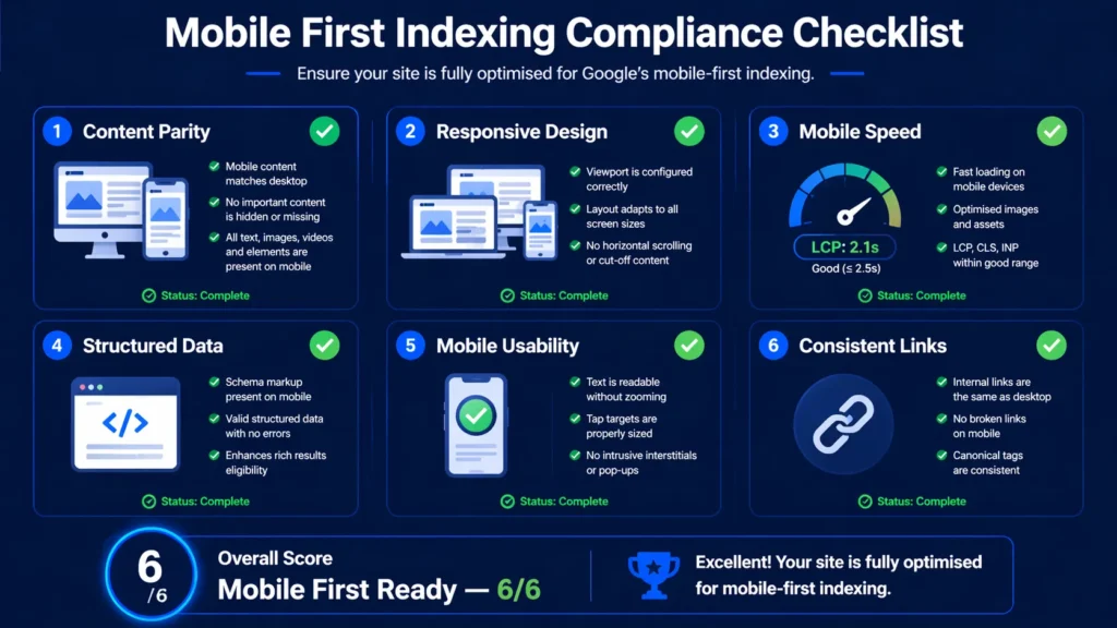
Step 1: Ensure Content Parity Between Mobile and Desktop
Your mobile website must contain ALL the content present on your desktop website. This is the non-negotiable foundation of mobile first indexing compliance:
- Audit both your mobile and desktop pages side by side — check that every heading, paragraph, image, and structured data element present on desktop also appears on mobile.
- Remove any CSS that hides content on mobile using display:none — if the content is valuable enough for desktop, it is valuable enough for Google to evaluate on mobile.
- For accordion and tab content: Google’s current guidance is that tabbed content on mobile does carry ranking weight — but fully visible content still carries more weight than hidden content. Where possible, make key content visible by default on mobile.
- For separate mobile URLs (m.example.com): ensure the mobile version contains all the content of the desktop version — not a simplified subset.
- Check images — every product image, infographic, and editorial image on desktop should have a mobile-appropriate equivalent.
Step 2: Implement Responsive Design
Responsive design — where a single website URL automatically adjusts its layout for different screen sizes — is the approach Google recommends for mobile first indexing. With responsive design, there is only one version of your content, so there is no risk of mobile-desktop content parity issues.
If your website currently uses a separate mobile URL structure (m.example.com), migrating to a responsive design eliminates an entire category of mobile first indexing risks — including content parity, duplicate content, and metadata inconsistency issues.
Step 3: Optimise Mobile Page Speed
Mobile page speed is both a Core Web Vitals signal and a critical mobile first indexing performance factor. Your mobile LCP, INP, and CLS scores directly affect your ranking under mobile first indexing — and mobile scores are almost always worse than desktop scores.
- Compress and convert images to WebP — uncompressed images are the most common mobile speed killer.
- Implement caching at server level for mobile pages.
- Use a CDN to serve assets from servers geographically close to your mobile users.
- Defer non-critical JavaScript — mobile devices have less processing power and JavaScript execution is proportionally more expensive.
- Reduce third-party scripts — analytics, chat widgets, and marketing tools load more slowly on mobile connections.
Our technical seo service dubai addresses every mobile performance factor — from image optimisation to JavaScript deferral — ensuring your mobile site meets Google’s Core Web Vitals Good thresholds for all three metrics.
Step 4: Verify Structured Data on Mobile
Every schema markup type implemented on your desktop version must also be present and valid on your mobile version. Use Google’s Rich Results Test on your mobile page URL to verify that all structured data is accessible to Googlebot Smartphone:
- Local Business schema — critical for businesses targeting local search.
- Product schema — critical for e-commerce mobile first indexing.
- Review schema — must be present on mobile to appear in mobile search rich results.
- FAQ schema — must render correctly on mobile pages.
- Breadcrumb schema — helps mobile navigation signals.
Step 5: Fix Mobile Usability Issues
Google Search Console’s Mobile Usability report (under Experience) flags specific usability problems that affect mobile first indexing compliance:
- Text too small to read: Set a base font size of at least 16px for body text on mobile
- Clickable elements too close together: Buttons and links need minimum 48x48px touch targets with adequate spacing between them
- Content wider than screen: Horizontal scrolling is a usability failure — ensure all content fits within the viewport width
- Viewport not set: Add <meta name=’viewport’ content=’width=device-width, initial-scale=1’> to every page’s HTML head
- Flash content: Adobe Flash is not supported on iOS and most modern Android browsers — replace with HTML5
Step 6: Ensure Consistent Internal Linking
Your mobile version must contain the same internal links as your desktop version. Mobile navigation that removes links to certain pages (to simplify the mobile menu) means Googlebot Smartphone cannot follow those links during crawling — reducing the crawl coverage and link equity flow for linked pages.
Pro Tip — Test the Rendered Mobile Page in GSC
The most accurate way to see exactly what Googlebot evaluates for mobile first indexing is not testing in a mobile browser — it is using Google Search Console’s URL Inspection Tool → View Crawled Page → Screenshot. This shows the actual rendered mobile page that Google stored when it last crawled your site. Compare this screenshot with your live mobile page to identify any discrepancies between what Google sees and what your users see.
Mobile First Indexing and E-Commerce SEO
The impact of mobile-first indexing on e-commerce SEO is more significant than in most other sectors because e-commerce websites have three compounding challenges: large page counts, high content volume per page, and the direct revenue connection between search rankings and sales.
E-Commerce Mobile First Indexing Problems
- Product description truncation: Many e-commerce sites show abbreviated product descriptions on mobile with a ‘Read more’ link. Google has stated that expandable content carries less ranking weight — full product descriptions should be visible on mobile.
- Missing product images on mobile: Some e-commerce sites reduce product image galleries on mobile to improve load speed. Under mobile first indexing, image signals from the mobile version determine ranking — fewer images means fewer signals.
- Absent Product schema on mobile: Product schema (price, availability, rating) that only renders on desktop will not contribute to mobile search rich results — losing the star ratings and price display that significantly improve click-through rates.
- Slow category page loading: Category pages with many product images are among the slowest-loading pages on e-commerce sites. Mobile category page load time directly impacts both rankings and conversion rates.
E-Commerce Mobile Optimisation Priorities
- Implement lazy loading for product images — load images as users scroll rather than all at once
- Use next-gen image formats (WebP/AVIF) for all product images
- Keep product descriptions fully visible on mobile — no truncation for key content
- Ensure Product schema renders correctly on mobile pages
- Test checkout flow on mobile — a fast, smooth checkout process reduces cart abandonment from mobile users
- Implement AMP or optimise native mobile speed for category and search result pages
How Businesses Can Adapt Their SEO to Mobile First Indexing
How businesses can adapt their SEO to mobile first indexing requires treating mobile optimisation as a permanent business priority rather than a one-time technical task. The businesses that maintain the strongest search visibility are those that have built mobile-first thinking into every aspect of their website management:
Content Creation — Write for Mobile First
When creating new content, consider how it will appear and read on a smartphone screen before considering the desktop experience. Use shorter paragraphs (2 to 3 sentences), clear subheadings every 200 to 300 words, and bullet points to break up dense text. This structure performs better on mobile screens and, under mobile first indexing, signals content quality more effectively to Google.
Design Decisions — Mobile as the Primary Canvas
When making website design decisions, start with the mobile layout and scale up to desktop — rather than designing for desktop and scaling down. This ‘mobile-first design’ approach naturally produces better mobile experiences and eliminates the desktop-to-mobile degradation that creates mobile first indexing problems.
Performance Monitoring — Mobile Metrics First
Monitor your mobile PageSpeed Insights scores and Core Web Vitals field data as your primary performance metrics. Your mobile scores determine your rankings — desktop scores are secondary. Set mobile score benchmarks and treat any deterioration in mobile Core Web Vitals as an urgent priority.
Testing Protocol — Always Test on Real Mobile Devices
Before publishing any new page or design change, test it on at least two real mobile devices (not just browser developer tools which do not fully replicate mobile rendering). Check: text readability, touch target sizes, image loading, navigation functionality, and form usability. What looks fine in browser dev tools can fail on real devices.
Mobile First Indexing for Separate Mobile URLs
For websites still using separate mobile URLs (m.example.com or mobile.example.com), mobile first indexing creates specific requirements that differ from responsive design websites:
- Your m. URLs must contain ALL the content that appears on the equivalent desktop URL — never a simplified subset.
- Canonical tags must be implemented correctly: the mobile URL should have a canonical pointing to the desktop URL, and the desktop URL should have a rel=’alternate’ pointing to the mobile URL.
- Structured data must be implemented on BOTH the mobile and desktop versions — not just desktop.
- Both versions must have the same metadata (title tags, meta descriptions, robots directives).
- Internal links on the mobile version must mirror those on the desktop version.
Google strongly recommends migrating from separate mobile URLs to responsive design for simplicity and mobile first indexing compliance. Maintaining two separate URL systems creates ongoing risk of content divergence that directly suppresses rankings.
Expert Insight: Mobile First Indexing Impact on UAE Business Websites
Expert Insight — Mobile First Indexing in the UAE Market
After auditing hundreds of UAE business websites for mobile first indexing compliance, the most impactful and most common problem is content parity failure — particularly on e-commerce and real estate websites. The UAE has one of the highest smartphone penetration rates in the world, with over 95% of internet users accessing the web via mobile. Yet despite this mobile-dominant user base, the majority of UAE business websites were designed desktop-first and have never been properly audited for mobile content parity. The typical UAE e-commerce website we audit has 30 to 40% less visible content on mobile than desktop — primarily because product descriptions are truncated, specification tables are removed from mobile layouts, and schema markup is implemented in desktop-specific code. This directly causes the pages to rank for fewer keywords on mobile search — which is where the majority of their customers are searching. Fixing mobile content parity consistently produces ranking improvements within 4 to 6 weeks for the affected pages.
Case Study: How Fixing Mobile First Indexing Issues Improved Rankings by 156%
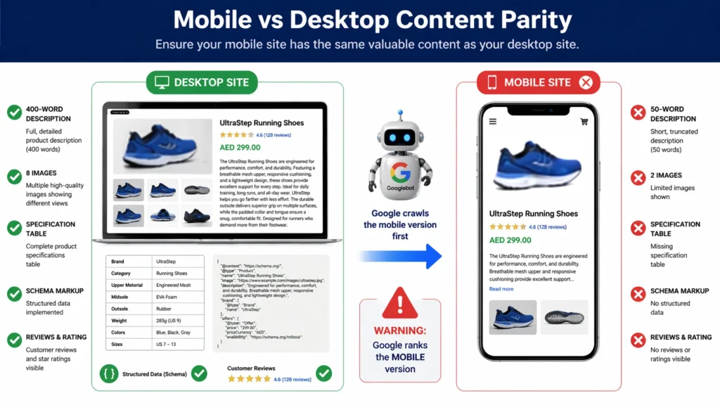
A Dubai-based property listing platform had a website that worked on two separate URL systems — desktop at properties.example.com and mobile at m.properties.example.com. Their mobile site had been designed years earlier as a simplified version of the desktop: no property specification tables, abbreviated descriptions (50 words versus 400 words on desktop), fewer property images, and no schema markup.
Since Google’s complete rollout of mobile first indexing, the platform had experienced a gradual but consistent ranking decline — losing first-page positions for 68 target property search keywords over 18 months. The cause was not their link profile or content quality — it was that Google was evaluating their thin mobile content rather than their rich desktop content.
The remediation we implemented over 10 weeks:
- Content parity audit: identified 847 property pages with significant mobile-desktop content discrepancies.
- Full property descriptions added to mobile pages — matching the 400-word desktop descriptions exactly.
- Specification tables migrated to mobile-responsive HTML tables accessible on all screen sizes.
- Property image galleries — mobile pages updated from 3 images to match the 8-image desktop galleries.
- Property and LocalBusiness schema markup implemented on all mobile pages.
- Mobile page speed optimised — LCP reduced from 6.8 seconds to 2.3 seconds through image compression and lazy loading.
- Canonical and alternate tag implementation audited and corrected across all 847 pages.
Results after 12 weeks: Rankings for the 68 target keywords improved — 41 returned to first page positions and 14 moved to position 1 to 3. Organic traffic grew by 156% compared to pre-fix levels. Mobile-sourced property enquiries increased by 212%. The platform had been losing significant revenue for 18 months due to mobile first indexing content parity issues that a basic mobile audit would have detected.
Related Technical SEO Guides
Mobile first indexing optimisation is most effective when combined with a comprehensive technical SEO approach:
- What Is Technical SEO — Understand how mobile first indexing fits within the complete technical SEO framework.
- What Are Core Web Vitals and How to Improve Them — Optimise the mobile speed metrics that mobile first indexing evaluates.
- How to Speed Up Your WordPress Website — Improve your WordPress mobile page speed for better mobile first indexing performance.
- How to Fix Crawl Errors in Google Search Console — Fix mobile crawl errors that affect Googlebot Smartphone’s access to your pages.
- How to Fix Indexing Issues in Google Search Console — Resolve mobile indexing problems discovered in the Pages Coverage report.
- What Is a Sitemap and How to Submit It to Google — Ensure your mobile pages are discoverable through a properly submitted sitemap.
Frequently Asked Questions — Mobile First Indexing
What is mobile first indexing?
Mobile first indexing means Google primarily uses the mobile version of your website — not the desktop version — to crawl, index, and rank your content. Google’s Googlebot Smartphone (the mobile crawler) is the primary agent that evaluates your website. The content, structure, speed, and structured data on your mobile pages are what determine your search rankings.
When did mobile first indexing start?
Mobile first indexing started as a limited experiment in 2016, began gradual rollout to select websites in 2018, accelerated through 2019 to 2020, and reached universal deployment in 2021 when Google confirmed all websites had been migrated to mobile-first indexing. From 2021 onwards, all websites — new and existing — are crawled and indexed mobile-first by default.
Does Google still use mobile first indexing?
Yes — Google still uses mobile first indexing and has no plans to change this approach. Mobile first indexing is the permanent standard for Google’s search index. There is no way to opt out or request desktop-first crawling. Every website is evaluated by Googlebot Smartphone as the primary crawling agent.
What does mobile first indexing mean for my website?
Mobile first indexing means that what appears on your mobile website — not your desktop website — determines your search rankings. If your mobile site has less content, slower loading, missing structured data, or worse user experience than your desktop site, your rankings reflect the mobile deficiencies. Improving your desktop site while neglecting mobile will not improve your rankings under mobile first indexing.
What are the most common mobile first index problems?
The most common mobile first index problems are: (1) Content parity issues — mobile pages showing less content than desktop. (2) Mobile page speed failures — particularly slow LCP from uncompressed images. (3) Missing structured data on mobile — schema only present on desktop. (4) Blocked mobile resources — CSS or JS blocked from Googlebot Smartphone. (5) Different metadata on mobile and desktop versions.
How to prepare for mobile first index?
To prepare for mobile first index: (1) Audit mobile vs desktop content parity and add any missing content to mobile. (2) Test your mobile page speed and fix Core Web Vitals failures. (3) Verify structured data is present on mobile pages using Google’s Rich Results Test. (4) Fix mobile usability issues reported in Search Console. (5) Ensure all internal links present on desktop are also present on mobile. (6) Test mobile pages with the URL Inspection Tool to see what Googlebot Smartphone renders.
Does Bing use mobile first indexing?
Bing has not formally announced a mobile-first indexing equivalent to Google’s system. Bing continues to evaluate both mobile and desktop versions of websites, though it gives significant weight to mobile-friendly design and mobile user experience. Optimising for Google’s mobile first indexing requirements generally improves performance across all search engines.
What is the importance of mobile first indexing?
The importance of mobile first indexing lies in the fundamental shift in how rankings are determined. Since mobile first indexing, your search rankings are determined by your mobile experience — which is what the majority of your searchers use anyway. Businesses with poor mobile experiences face a double penalty: they rank lower in search results AND they convert fewer of the visitors they do receive.
How does mobile first indexing affect e-commerce SEO?
Mobile first indexing significantly impacts e-commerce SEO because e-commerce sites typically have the most significant mobile-desktop content disparities. Product descriptions that are truncated on mobile, specification tables removed from mobile layouts, and Product schema absent from mobile pages all result in reduced keyword coverage and ranking positions for mobile searches — which represent the majority of product-related searches.
What is the difference between mobile-friendly and mobile first indexing?
Mobile-friendly means a website is usable on a smartphone — it renders correctly, text is readable, and navigation functions. Mobile first indexing means Google uses the mobile version as the primary ranking signal — regardless of whether the site is mobile-friendly. A site can be technically mobile-friendly (it renders without error on mobile) but still fail mobile first indexing if its mobile content is thinner than its desktop content.
How do I know if my website has mobile first indexing problems?
Check for mobile first indexing problems using: (1) Google Search Console → URL Inspection → View Crawled Page → Screenshot — compare with your live mobile page. (2) Search Console → Experience → Mobile Usability for flagged usability issues. (3) Compare your mobile and desktop pages side by side in different browser windows, checking for content differences. (4) Google’s Rich Results Test on mobile URLs to verify structured data is present.
How can businesses adapt their SEO to mobile first indexing?
Businesses can adapt to mobile first indexing by: treating mobile as the primary version of their website (not a secondary simplification), ensuring complete content parity between mobile and desktop, optimising mobile page speed as the priority performance metric, testing all new content on mobile devices before publishing, implementing responsive design rather than separate mobile URLs, and conducting quarterly mobile first indexing compliance audits.
Does hiding content in tabs or accordions on mobile affect rankings?
Google has stated that content hidden in tabs, accordions, and expandable sections on mobile does carry ranking weight — but at a lower level than fully visible content. For critical content (primary product descriptions, key service information, main body content), make it visible by default on mobile. Reserve expandable/collapsible presentation for secondary content (FAQs, technical specifications, related products) where the interaction provides genuine user value.
What tools can I use to test mobile first indexing compliance?
The most effective tools for testing mobile first indexing compliance are: Google Search Console URL Inspection Tool (shows actual Googlebot Smartphone rendered page), Google’s Mobile-Friendly Test (basic usability check), Google PageSpeed Insights (mobile speed and Core Web Vitals), Google Rich Results Test (structured data on mobile), and Screaming Frog (set user-agent to Googlebot Smartphone for mobile crawl simulation). Our technical seo service dubai conducts comprehensive mobile first indexing audits using all these tools.
How long does it take to see improvements after fixing mobile first indexing issues?
After fixing mobile content parity issues, structured data, and mobile page speed, initial ranking improvements typically appear within 4 to 8 weeks — once Google has recrawled and re-evaluated the improved mobile pages. For websites with significant content additions to mobile pages, request re-indexing through Search Console’s URL Inspection Tool for priority pages to accelerate recrawling. Our seo agency dubai provides complete mobile first indexing optimisation — from audit through implementation and monitoring.
Conclusion: Mobile First Indexing Is Permanent — Optimise Accordingly
Mobile first indexing is not a temporary experiment or a future requirement — it has been Google’s universal standard since 2021 and will remain so for the foreseeable future. Every ranking your website achieves is now determined by your mobile experience. Every piece of content you create is evaluated in its mobile form first.
The businesses that have adapted fully to mobile first indexing — ensuring complete content parity, optimising mobile speed, implementing structured data on mobile, and fixing mobile usability issues — consistently outperform competitors who are still designing desktop-first and treating mobile as a secondary concern.
Begin your mobile first indexing audit today. Use Google Search Console’s URL Inspection Tool to see what Googlebot Smartphone sees on your key pages. Compare your mobile and desktop content side by side. Fix any content that is hidden, truncated, or absent on mobile. Measure your mobile Core Web Vitals and address any failures. These improvements feed directly into better rankings — because under mobile first indexing, better mobile experience means better search performance.Need expert help with your mobile first indexing optimisation? Our technical seo service dubai provides complete mobile first indexing audits — identifying every content parity issue, mobile performance problem, and structured data gap — and implementing all fixes to maximise your mobile search visibility. Get your free technical SEO audit today.


1 Comment
Marilyn
April 25, 2026 at 2:22 pmMy brother recommended I might like this website.
He was once entirely right. This post actually made my day.
You cann’t consider just how much time I had spent for this information! Thanks!